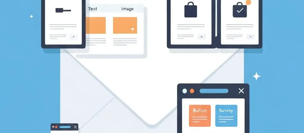
Campaign Builder Drag and Drop: Creating Campaigns Visually in 2026
If you have ever spent three hours wrestling with HTML email templates only to have them render as a jumble of broken layouts across different email clients, drag-and-drop campaign builders were made for you. A campaign builder drag and drop interface lets you assemble professional email campaigns by moving content blocks around a visual canvas — no HTML knowledge required, and no email client inconsistencies to debug.
This tutorial walks through everything you need to know: how drag-and-drop builders work, how to create your first campaign from scratch, email template best practices, and how to go from blank canvas to sent campaign in under an hour.
How a Drag-and-Drop Campaign Builder Works
At its core, a drag-and-drop email builder renders your email as a series of rows stacked vertically, where each row can contain one or more columns, and each column holds one or more content blocks.
The layout hierarchy looks like this:
- Email (the full message)
- Row (a horizontal stripe of the email)
- Column (a vertical subdivision of the row, e.g., 1-column, 2-column)
- Block (the actual content: text, image, button, etc.)
- Column (a vertical subdivision of the row, e.g., 1-column, 2-column)
- Row (a horizontal stripe of the email)
When you drag a content block from the left panel and drop it into a column, the builder inserts it into the email’s underlying HTML structure — handling table-based layout, inline CSS, and client compatibility automatically. You see a live preview; the builder handles all the technical complexity behind the scenes.
Core Content Blocks and When to Use Each
| Block Type | Use Case | Key Setting |
|---|---|---|
| Text | Headlines, body paragraphs, captions | Font size, line height, padding |
| Image | Hero images, product photos, logos | Alt text (required), max-width, link |
| Button | Primary CTA | Button URL, background color, border radius |
| Divider | Visual separation between sections | Line style, padding above/below |
| Spacer | Add breathing room between blocks | Height in pixels |
| HTML | Custom code when the builder’s options aren’t enough | Raw HTML editor |
| Social links | Footer social media icons | Platform URLs, icon style |
| Video thumbnail | Drive clicks to a YouTube/Vimeo video | Video URL (generates play-button thumbnail) |
| Dynamic content | Show/hide sections based on contact attributes | Condition (e.g., “Show only if plan = Pro”) |
Step-by-Step: Build a Campaign from Blank
We are going to build a product announcement email: a hero section, brief body copy, a CTA button, and a footer. This covers the core skills for every campaign type.
Step 1: Create a new campaign and name it
In CampaignOS, go to Campaigns → New Campaign → Email. Give it an internal name that clearly describes its purpose (e.g., “Product Announcement — March 2026 — All Users”). The internal name is not visible to recipients.
Step 2: Choose your starting point
Three options: start from a blank canvas, start from a pre-built template, or duplicate an existing campaign. For this tutorial, choose blank. (Once you have templates you are happy with, duplicating a campaign is the fastest option for recurring sends.)
Step 3: Set the email-level settings
Before touching the canvas, configure: background color (the area outside the email body), email width (600px is the universal standard), and default font (pick a web-safe font or a Google Font).
Step 4: Build the header
Drag a 1-column row to the top of the canvas. Drag an Image block into it. Upload your logo and set the width to approximately 150px. Add a Spacer block above and below the logo for padding. Set the row background color to your brand primary color if desired.
Step 5: Build the hero section
Add a new 1-column row below the header. Drag in an Image block and upload your hero image (1200px × 600px recommended, under 200kb). Below that, add a Text block for your headline (H1 style in the text editor, approximately 28–32px font size). Add another Text block for the sub-headline.
Step 6: Add body copy
Add a new row. Drag a Text block. Write 2–3 short paragraphs. Keep the line length under 60 characters per line for readability (achieved by the 600px email width plus left/right padding of 30px).
Step 7: Add the CTA button
Drag a Button block below the body copy. Configure: button text (“See What’s New”), URL (your landing page), background color (brand primary), text color (white), border radius (4px for a modern look, higher for pill-shaped), and minimum width (200px). Add spacers above and below.
Step 8: Build the footer
Add a new row with a contrasting light gray background. Add: your company name and address (required by CAN-SPAM), a Divider, Social links, and the unsubscribe text + link. The platform should auto-inject the unsubscribe link when you use the standard token — check your platform’s documentation.
Step 9: Preview and test
Click Preview to see desktop and mobile views side by side. Switch to mobile view — every row should stack gracefully, button tap targets should be finger-friendly, and text should be readable without zooming. Send a test email to yourself and check it in at least two email clients (Gmail and Outlook are the most important).
Step 10: Configure campaign settings and send
Set your subject line, preheader text, from name, and from email. Select your recipient segment. Choose to send now or schedule at a future time. Review the campaign summary (number of recipients, estimated send time) and confirm.
Email Layout Best Practices
- One column for most content: Multi-column layouts look elegant on desktop but stack awkwardly on mobile. Use 2-column layouts only where the content genuinely benefits from side-by-side comparison.
- Maximum email width: 600px. This has been the email standard for over a decade and renders correctly across all major clients.
- White space is your friend. Cramped emails feel overwhelming. Use spacer blocks liberally — most designs need at least 20–30px of padding inside each content row.
- Keep emails short. The longer the scroll, the lower the CTA click rate. Lead with the most important content; every element below the CTA is competing for the same click.
- Brand consistency: Use the same primary colors, fonts, and logo placement across every campaign. Subscribers recognize your email in the first half-second of scanning — inconsistent design destroys that recognition.
Mobile Optimization in the Builder
Most builders offer mobile-specific settings that override desktop defaults for small screens:
- Stack columns on mobile: A 2-column row that looks fine on desktop should stack vertically on mobile. Enable this in the row settings.
- Mobile font size override: If your desktop body text is 16px, ensure mobile is set to at least 16px too. Some builders default to smaller sizes on mobile — fix this manually.
- Hide on mobile: Certain elements (decorative images, supplementary columns) can be hidden on mobile without affecting the core message. Use this to simplify the mobile experience.
- Touch-friendly CTA buttons: A button that is 44px tall and at least 200px wide is comfortable to tap. Anything smaller frustrates mobile users.
Using Personalization Tokens
Drag-and-drop builders let you insert merge tags (also called personalization tokens) anywhere in a text block. Common tokens:
{{first_name}}— contact’s first name{{company}}— contact’s company name{{plan}}— current subscription plan (great for SaaS){{unsubscribe_url}}— auto-generated unsubscribe link{{view_online_url}}— view email in browser link
Use first_name sparingly — in the subject line and once in the opening line is enough. Overusing personalization tokens (“Hi {{first_name}}, here is {{first_name}}’s special offer…”) feels performative rather than personal.
Building a Reusable Template Library
Once you have built campaigns you are happy with, save them as templates. Aim to build and maintain these standard templates:
- Newsletter template: Header, content blocks with image + text, footer
- Promotional template: Hero image, headline, copy, bold CTA button, footer
- Plain text style: Minimal HTML, looks like a personal email — great for relationship-building sends
- Transactional template: Clean, minimal, your logo, the core information, footer with unsubscribe
- Announcement template: Feature or news announcement with CTA to learn more
With a library of 5 templates, any campaign can be assembled in under 20 minutes. For a deeper dive into the workflows behind these campaigns, read our Visual Workflow Builder tutorial and the Email Marketing Best Practices guide.
Do It With CampaignOS
CampaignOS includes a full-featured drag-and-drop campaign builder with:
- 30+ pre-built templates organized by use case (newsletter, promotional, onboarding, re-engagement)
- Dynamic content blocks — show or hide sections based on any contact attribute without writing conditional code
- Live mobile preview — toggle between desktop and mobile views as you build, not just after
- Template locking — lock header and footer rows so team members editing campaign content cannot accidentally break your branding
- Saved blocks library — save individual blocks (a custom CTA, your signature section, a social proof block) for reuse across campaigns
- Inbox rendering preview — preview how your email will look across Gmail, Outlook, Apple Mail, and mobile clients before sending
Try the campaign builder for free at app.campaignos.site. Build your first email campaign in minutes.
Frequently Asked Questions
Do I need to know HTML to use a drag-and-drop email builder?
No. Drag-and-drop builders handle all the HTML and CSS internally. You work with a visual interface and the builder generates cross-client-compatible HTML in the background. The optional HTML block lets you add custom code in specific sections if needed, but this is never required for standard email layouts.
Why does my email look different in Outlook than in the builder preview?
Outlook (especially older versions on Windows) uses Microsoft Word’s rendering engine rather than a browser engine, which handles CSS differently from Gmail, Apple Mail, or mobile clients. Good drag-and-drop builders generate Outlook-compatible HTML automatically using table-based layouts and VML fallbacks. If you are seeing rendering issues, look for a builder with a dedicated Outlook compatibility mode or rendering preview.
What image format is best for email campaigns?
JPEG for photographs (best compression for photos), PNG for graphics with transparency, and GIF for simple animations. Avoid WebP — it is not universally supported across email clients. Keep total image file size under 1MB for the entire email, and keep each individual image under 200KB. Images that are too large slow load times, especially on mobile.
Can I reuse blocks across multiple campaigns?
Yes, if your builder supports saved blocks (CampaignOS calls these “Saved Blocks”). You design a block once — say, a customer testimonial block or a product feature block — and save it to your library. Then drag it into any future campaign without recreating it. Updates to a saved block can propagate to all campaigns using it, depending on platform settings.
How do I make my CTA button accessible for screen readers?
Ensure your button has descriptive, meaningful text — “Download the free guide” is better than “Click here.” Avoid using an image as a button, since images can be blocked and screen readers cannot read them without alt text. Most drag-and-drop builders render buttons as styled anchor tags with proper HTML, which screen readers handle correctly.
How many images should I include in a marketing email?
Keep it to 1–3 images for most campaigns. One hero image, possibly a product image, and an optional small logo or icon. Emails that are primarily images (and light on text) trigger spam filters more easily and fail completely if image loading is disabled — which is the default behavior in many corporate email clients. Always ensure your core message is readable even if all images are blocked.